I told my friend Nancy about my blog. She’s in her seventies and can barely use email. I told her about my plan to change the website development industry with my writing and coaching.
“Tell them to quit being mean to old people!” she said.
She went on to complain about not being able to read the font on websites. Too light. Too small.
“Just because you know I am supposed to click on something doesn’t mean that I know I’m supposed to click on something!”
I said, “Yeah! That sounds like a problem with the user experience. When things aren’t designed well, that creates cognitive fatigue.”
I got a kick out of using a phrase I had just learned: cognitive fatigue.
Nancy immediately responded with a raised voice, “NO! It creates murderous rage! And, we old people, if we knew where these developers lived, we’d HOBBLE over there with our walkers and beat them to death with our canes!”
Nancy does not have a walker or a cane. But she does have strong feelings about her recent battle with an online registration form.
The form won.
Nancy’s struggle with technology has nothing to do with her intelligence or aptitude.
It has to do with a failure among website designers to accommodate the needs of disabled website users.
Website designers don’t know how to accommodate the needs of people beyond their own age cohort and physical ability.
So what? Why does it matter?
That’s like asking why the American’s with Disabilities Act (ADA) matters. The ADA was a response to the widespread, systemic, inhumane discrimination against people with disabilities in the U.S.
Robert L. Burgdorf Jr., writer of the ADA, talked about how a New York court described the conditions at Willowbrook State School in 1972: “horrible,” “dreadful,” “sub-human,” “a blot on the conscience,” “not only appalling but frightful,” a place where “the most helpless and defenseless of our citizens were left living on a thread of life … rotting in inadequate warehouses, the living among the dead, the dead among the living.”
You might be thinking, “C’mon Emily! We’re talking about websites here. It’s not the same thing.”
As I write this post from my home office in Columbus, Ohio, I am following a stay-at-home order put in place by governors throughout our nation.
I’m using screen-share technology and social media like my life depends upon these tools.
And, in a way, my life does. My livelihood depends on being able to communicate with my employees. My social life depends on connecting with family and friends over video.
To their delight and mine, I’ve introduced many of my friends to their first Zoom experiences over recent weeks. One of my friends is legally blind. She holds her phone right up to her nose to read a text.
When I send her a Zoom link via text, she struggles to join the meeting. The “one-tap” feature provided by Zoom doesn’t always work for her; she struggles with understanding confusing prompts that require additional action.
My legally blind friend is a Ph.D. and teaches at a local community college. She’s one of the toughest people I know and she’s missing out on the very things that are keeping me sane right now. At the same time, she’s expected to continue teaching her classes virtually.
The web is the primary way for people to connect right now.
Yes, there’s the phone and television. But the web is the most flexible, nimble way people are connecting and creating experiences together for the foreseeable future.
We’re watching concerts and playing games together.
We’re going to little virtual parties.
Connecting and giving each other emotional support.
You can’t do that with the same kind of immediacy on the phone or with TV.
And a lot of seniors and people with different abilities are missing out. All because design minimally takes them into account – or not at all.
Making our design more accessible is not a one-way street. It’s not about those of us who are not disabled or who are not seniors bestowing our kindness for the betterment of the less fortunate.
Universal design helps me connect, too. My quality of life is affected when I don’t get to socialize with and emotionally engage with my disabled friends and family.
My own pet peeves in website user experience
Font Size and Readability

Is the font size large enough? Is there enough contrast between the font color and the background color? Or, are you using a subtle gray on light gray font-color and background-color combination? Poor readability is the most common user experience complaint.
Clear instructions
Keep the website visitor’s goal in mind. Take e-commerce for example. Rarely do e-commerce customers want to pause their shoe shopping to read the blog. They want to buy shoes. You want them to buy shoes.
Walk the website visitor to their goal without distracting them. Guide them every step of the way until they reach the finish line. Don’t send them off to read the blog.
Use both words and images to guide them from one step to the next.
Search bars
Most website search bars just don’t work. Instead, they frustrate website visitors by providing poor results. They drive people away from websites. If your website has a search feature, then make sure it works by asking someone else to test it without prompting them with your preconceived search phrases.
Mediocre search bars are no substitute for clear and straightforward design that helps your website visitor navigate the website.
Does everything work?
Developers and their customers alike cannot wait for website projects to be done. The pressure to get to the finish line leads to cutting corners in quality control. The website “testing” is left to the end user of the website.
By the time all of the bugs are discovered, you, the developer, are long gone.
Or, if you’re still around, you get to experience the website project never being over. Your client will find the problems eventually and ask you to fix them.
As the developer, you’ve been looking at the website for too long. Ask someone who has never seen your website before to review it with fresh eyes.
Have your person navigate the website with purpose. Ask them to buy a product, complete a form, or register for something. Or, just ask them to see if they can find something. Watch them browse through the website. Can they find it? Are they lost? Or stuck? This exercise will yield valuable information and catch problems sooner rather than later.
Common website design UX mistakes
The best way to learn about making your website user friendly is to look at extreme examples of websites with poor design. Start with The World’s Worst Website Ever. This website jams in all of the ugly and annoying features of poor user experience into one page. Brace yourself and experience the world’s worst website ever: https://www.theworldsworstwebsiteever.com/
View the full list of The World’s Worst Website Ever design mistakes HERE ⇒


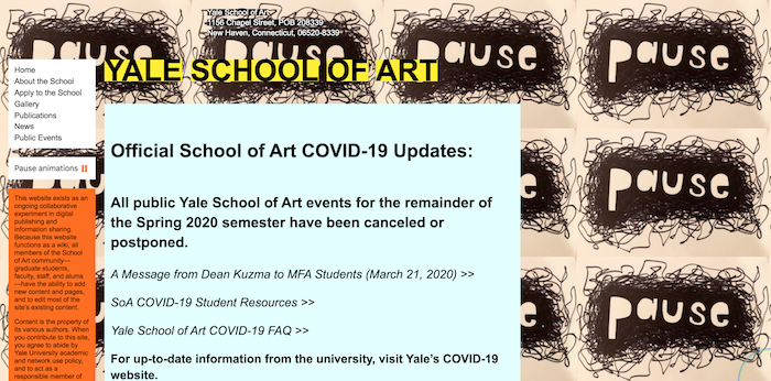
Fantastic read, Emily, and so true! A lot of the concepts you talk about in reference to website design are the same ones of selling anything espoused by motivational speakers since the dawn of time – “Walk the website visitor (customer) to their goal without distracting them. Guide them every step of the way until they reach the finish line.” I must confess, I had to go and check out the Yale School of Art website to see if that was REALLY what they did! Craziness. Thanks for a great read. Be safe. Be happy.
Thanks Mary. Yeah. It’s hard to look at Yale’s School of Art website. I wonder if they are just making a statement with it.
And, if that’s the case, what is it they are trying to say? 🙂